Brief
Yolk approached us to help realign their brand with their values and design a creative, consistent and robust visual system to apply across their communications.
Outcome
We developed the brand strategy of 'Reshaping Recruitment'. A platform to show how Yolk are changing their industry and working with all types of people.
Brand Strategy
Yolk work with people and businesses of all shapes and sizes and needed a flexible, exciting brand that would appeal to both candidates and companies looking to hire.


We developed the brand positioning concept 'Reshaping Recruitment', utilising abstract shapes to represent Yolk's audiences and markets. The concept, along with a bright and bold colour palette provides the foundation for the rest of the brand.
We created a huge number of slightly different shapes to represent clients and candidates, while the yellow dot in each application always references Yolk. This helps communicate the core messages of attracting the best talent and working in partnership with businesses in an abstract way.


Creating a design system
Once our initial brand strategy and design work was done, we would be handing over the reins to Yolk's internal team to maintain the brand. To help maintain consistency without the brand becoming predicable we developed a design system that is flexible and allows for creative freedom.

Messaging with motion
Brand messages hugely important in conveying company values. However, these can become white noise to their audience. We created a range of motion graphics to deliver key messages in a more captivating manner that were used throughout the new website.


The online brand
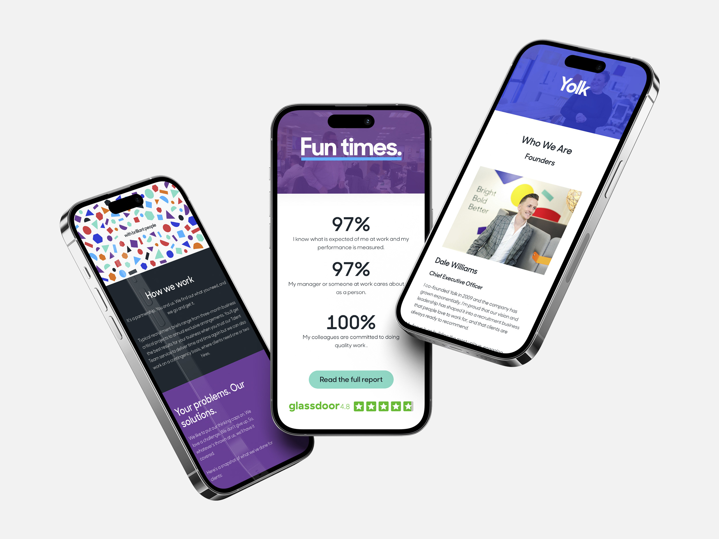
Yolk's website is a key part of their communication strategy, providing a central resource for job applications, as well as helping tell the brand story to its core audiences.
As part of the project we worked on the strategy and information architecture, wire framing and core messaging, and the visual design of the new site. Our work was then implemented by Volcanic, an agency who have developed a dedicated recruitment CMS and job posting platform.


Yolk came to us because the brand and communications didn't reflect the business. The team now have the strategy, brand position and platform to achieve their goal of reshaping recruitment.


