If you’re a marketing or brand manager, you might be tempted to adopt the latest design trend to help your brand stand out or feel fresh. In this article, I explain why you might want to think twice about following the flock.
Holographic surrealism, modern nostalgia, brutal grunge. No, not the possible names for my new sludge metal band, but the latest graphic design trends for 2023, according to some industry websites. They sound (and many look) great on the surface, but my unpopular opinion is: they should be avoided (well, mostly). Let me explain…

Examples of the 2023 Design Trends, as predicted by Dribbble
Ever since the dawn of the internet, design blogs and websites have started each new year predicting the biggest design trends that’ll fill our various screens for the next 12 months. It’s excellent clickbait, but is it a good idea? Or does it just add to the landfill of quickly outdated design applications, hot on the heels of the latest in fast fashion?
A trend of two camps
Let's start by understanding what a ‘trend’ is. I think of trends in two camps: big ‘T’ trends and small ‘t’ trends.
I see big ‘T’ trends as industry moving changes in direction, technology or thinking. These types of trends are likely to last decades, until the next big change. We saw this with the introduction of the iPhone, where a big ‘T’ trend started the use of multi-size, multi-use and multi-location screens. I’d wager that the next big landscape-changing trend is AI and its use as a creative tool.

Steve Jobs introduces the first iPhone
Small ‘t’ trends on the other hand are generally aesthetic and last for a short moment in time. We see this in fashion, interior design, music videos, and of course, graphic design. Remember NFTs? Guess which trend they fall into.
Should design follow trends?
If you’re a reader of those aforementioned articles celebrating the latest trends, or a client looking for inspiration, you might assume that working the ‘latest look’ into your brand will make you appear boxfresh and new. But as an agency that creates a long-term vision for our clients, we tend to avoid small ‘t’ trends.
I’ll admit, there are some applications where it might be just fine to follow the latest trend. Short-term, disposable marketing campaigns that only last a few months can be a good place to try them. But even then, you risk diluting the potential power of your underlying brand, or missing out on an opportunity to build stronger brand recognition. When it comes to applications where design needs to fit into a wide, long-lasting brand strategy, we’d say no, steer clear.
So, what are the little 't' trends to watch out for (and avoid) in 2023?
Ink traps

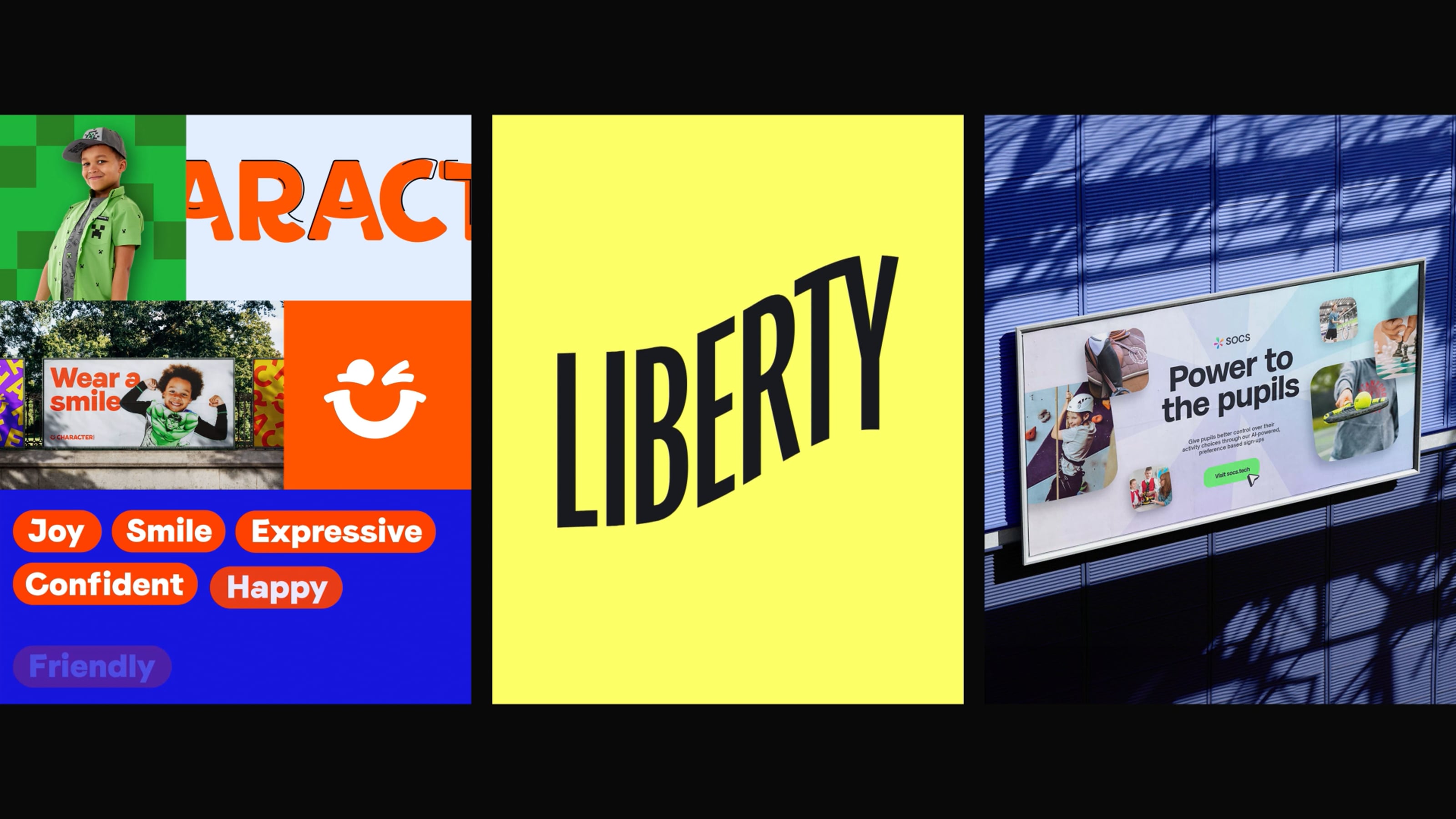
Example of an ‘ink trap’ typeface
Having been saturated with generic geometric typefaces for many years, lots of brands are turning to typography to add a burst of personality to their identity. One of the most obvious examples of this, are fonts with deliberate and exaggerated ink traps (what are ink traps?).
These certainly add quirkiness and character, but I have a feeling that in a couple of years, these will look very outdated and will need replacing.
Bento box layout

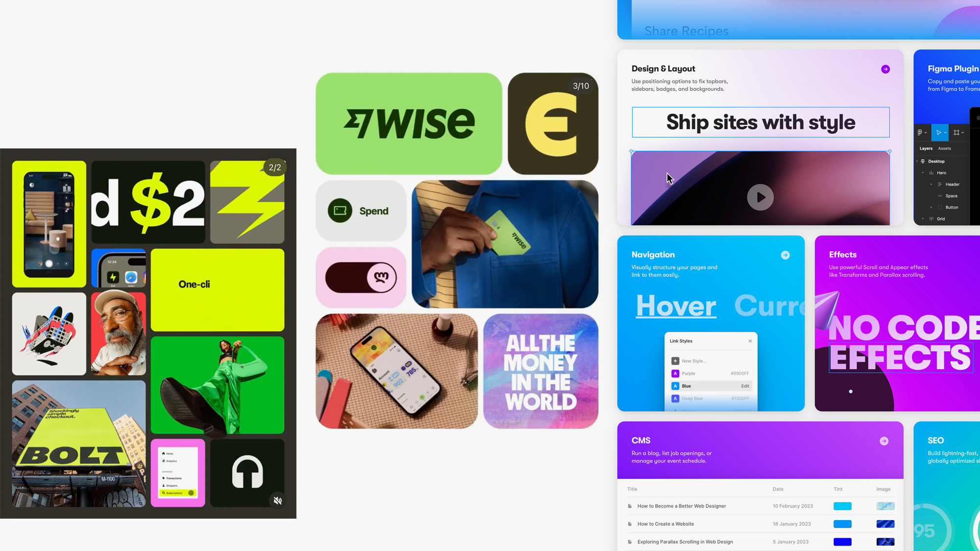
Examples of the use of a ‘Bento Box’ layout to showcase images
This one is everywhere. You know those Japanese trays, used to serve separated mouthfuls of tasty morsels? It's exactly that—but in design form. Bento box layouts offer a way to show multiple images in a grid of shapes. We saw this type of layout many years ago on the web with the introduction of Masonry web layout, but it's recently undergone a revival started by Apple keynotes, where they use the graphic device to showcase product highlights and specifications.

The Bento Box layout, a name coined by Apple in their internal design documentation
Heck, even hair colour brands are at it.

Since then the trend has exploded—and it’s not just tech and hair colour brands—even us designers are at it! The issue is Instagram feeds are becoming full of colourful boxes. And while there’s nothing wrong with this concept, it’s overused.
It’s become a standardised way to show multiple images in one go, and they all kind of look the same. That’s why, I feel this is a trend that will pass quickly and will feel outdated sooner rather than later.
Dark SaaS

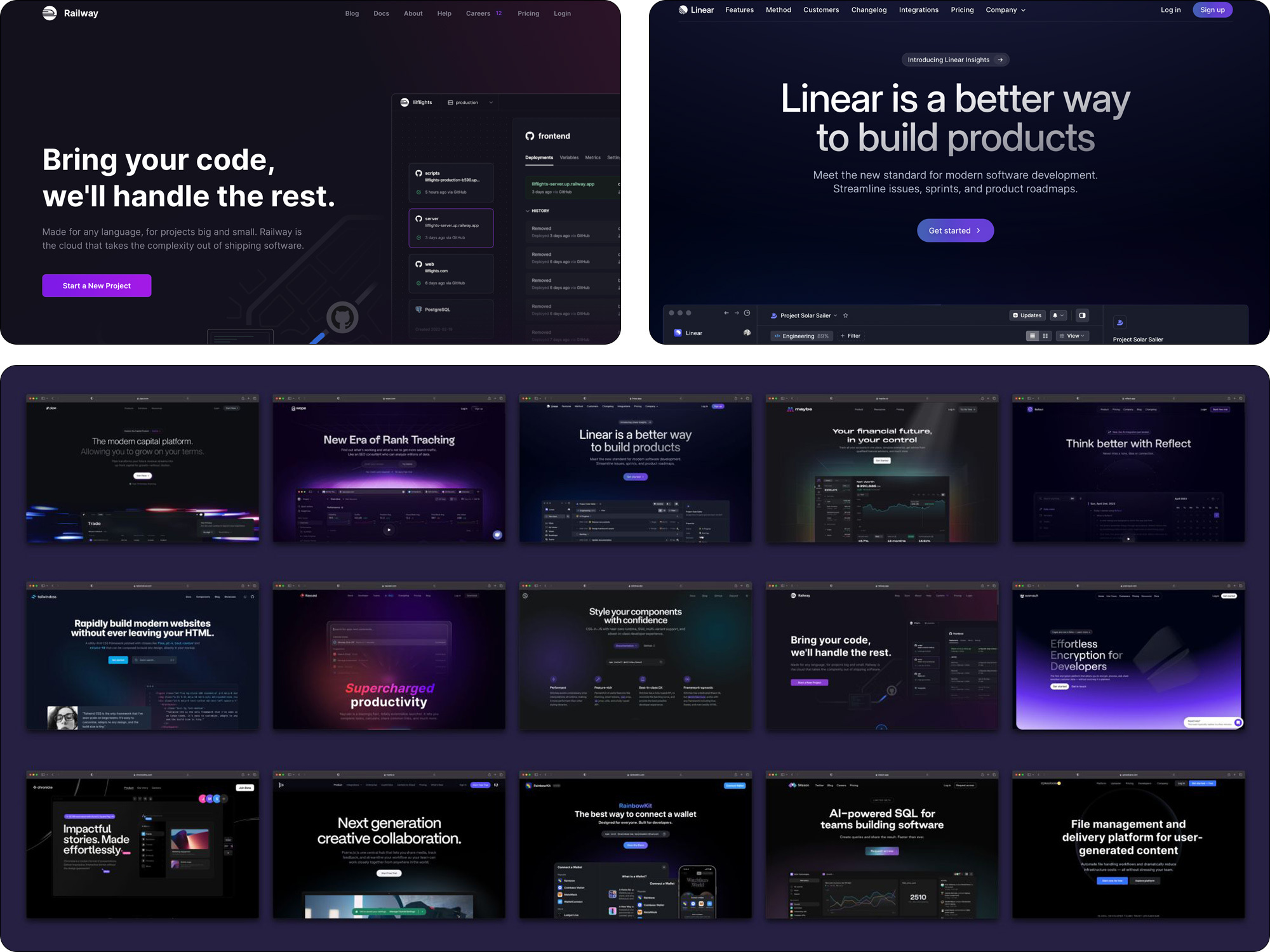
Examples of design trends in SaaS companies, originally posted by Max Ottignon (presented in a Bento Box layout)
Max Ottignon of Ragged Edge pointed this one out. The current trend for SaaS (Service as a Software) tech brands. Black, gradient-y with pops of colour, usually purple. Looks slick. Also looks pretty boring—and they all look the same.
This one is probably the best example of following trends being bad for design. Imagine a new SaaS company turning up with a white, bold, colourful design style amongst this group. Bucking the trend, immediately standing out.
When brand trends go wrong
Sitting somewhere between big ‘T’ and small ‘t’ trends is a fuzzy area. Let’s call them medium ‘T’ trends. We’ve seen this fuzzy type of trend work its way into some of the biggest brands in the world. At its heart, this trend is simplification, digitisation and the purposeful reduction of personality.
It’s understandable. New entrants into a market come with new ways of thinking and fewer constraints when it comes to brand—but also less history, heritage and tradition. The threat of these new players (possibly the inspiration they offer) has forced older, more established brands to rethink their identities. Alongside this desire to modernise is the need for simplification, and to take advantage of new digital technologies. This requires brands to work at smaller sizes in more compact ways.

Examples of fashion brands that have simplified their logos in recent years
Over the last few years many brands, particularly those in fashion, have been undertaking grand levels of brand reduction and simplification. Looking at the logos above, we can see a definite trend. Removal of heritage, personality and character, replaced by ubiquity, neutrality and some might say soullessness. If you look at the broader trend of simplification, you can see why this happened.

These fashion brands have simply followed the trend of simplifying their brand identities, a direction led predominantly by new entrants into their respective markets.
But, it hasn’t worked for all (at least the evidence points that way). Over the last 12 months, we’ve seen both Burberry and Saint Laurent roll back and revert to using their original identities, albeit updated and refined.

Burberry has undergone its third major brand redesign in 5 years

New, refined version of the ‘old’ Saint Laurent logo as used in its recent marketing
Why? Well, I think those identities had a power the brands didn’t fully appreciate. The power of alignment, heritage, connection and differentiation. How do the simplified identities align with their specific audiences? How do they reflect their long and rich histories? How do they connect emotionally? How are they different?
Quite simply, they don’t and they’re not.
We’ve seen this go wrong before. In 2009, juice brand Tropicana followed the trend of simplifying its packaging design, by introducing a new look for all its major product lines. In addition to the cost of the redesign, the new look launched with a $35m advertising campaign.

The failed Tropicana redesign that cost $50m
Looks great right?
Clean, simple, crisp and much more modern. Well, the juice drinkers of North America didn’t think so. Sales dropped by 20% and only 1 month later the company announced it would be returning to its original packaging design. In total, the initiative cost Tropicana more than $50m.
Does it really matter?
For brands operating in the physical world—with stores or physical products, it 100% matters. As the brands above prove, a misstep into ‘trend land’ can be an expensive mistake if it goes wrong.
For those brands just starting out, or living primarily in digital worlds, perhaps it matters a little less. They can be a bit more agile and adapt with the market. However, if your goal is to build a strong brand, that has value and can stand the test of time, I’d strongly recommend resisting the urge to jump on a trend bandwagon. Carve your own unique, ownable visual identity. Buck the trend.
If you’d like to talk to us about your brand, website or marketing campaign, get in touch.

