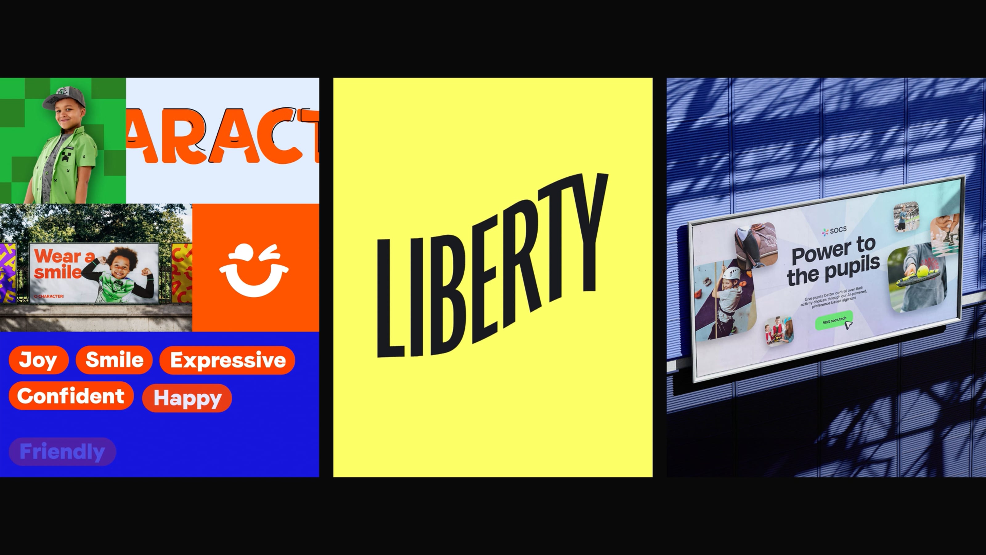
What's a mood board?
If you ask someone to describe a mood-board, most people will probably imagine a cluttered page full of imagery... a messy creation.
A mood-board can do so many things...
It can tell someone how you feel, explain your ideas without words, divide opinion, influence and inspire... or even just be something beautiful to look at.
We can make mood-boards work harder for us, we just need to make sure we use them to our advantage. This post talks about my experiences with mood-boards as a designer, as well as how you can use them to help your workflow.

Building your vision
All projects always need visual input at some point right?
The great thing about mood-boarding is that it can help you quickly get your ideas down without trying to create them from scratch. It's as simple as saving an image, taking a photograph, or taking a screenshot. These are all ways you can record ideas throughout your discovery process.
Be creative
Mood-boarding shouldn't be a chore, it's the beginning of a project where you are given the chance to explore something new and exciting!
A place you can build a picture of what you want to achieve, so make it your own. It's time to let the creative juices flow and start building the design vision.
Save it!
The great thing about all of us, is that we all look at things differently... Nobody takes the same road to get from A to B.
This means your approach to a creative brief will likely always be different to another designers, this is great! this is what makes us original.
Being able to record your approaches and ideas is SO important, I cannot stress how many times i've had a great idea and haven't written it down or put it somewhere to refer back to.
Treat your mood-board like your best friend, make it a place where every-time you return to it, you get even more excited.

Get lost in inspiration
Nowadays the internet is non-stop, with social media platforms like Instagram & Twitter becoming more and more about video content, meme's & trending topics. This means there's always visual content to look at and a diverse variety of opinions to read. It's important not to only look in one place when you are building your mood-board.
You never know, someone's meme might spark an idea that could lead onto something else, so save it! add it to your mood-board.
Oooooh I like the look of that!
When you find something that makes you feel excited, something that helps you level up in your process towards the big idea, I call these jewels.
The more jewels you find, the easier it will be to rationalise your thinking and communicate what you want the project to look & feel like.
By collating all of your thinking in one place allows you to carefully nit-pick jewels from your board, this will then help influence a design decision.

I've got my mood-board, but how do I use it?
We've all experienced working with clients that tend to favour bad design, or have an idea about a colour system that just doesn't really work. Well mood-boards can help eliminate some of these decisions, if we take more control as designers and use them tactfully.
As well has having one giant mood-board that captures everything, it's very important to segment a mood-board into smaller boards. Boards that look completely different to each-other.
By selecting different ideas that may contrast each-other allows the client to be forced to make decisions, these decisions can then help you as a designer paint the bigger picture to what they are looking for.

Deciding where the project goes
The beginning of a project is often an important part. The decisions you make around colour, typography and layout influences everything else that comes later on. The last thing you want is to be dictated by what the client wants, remember we are the experts!
If you can steer your client towards a strong look and feel early on, it will grow and get better when you start playing around with it in a design process.

Use your mood-boards to rationalise your solutions to the clients problem.
By asking specific questions related to your mood-boards like "How do you feel about the use of imagery in these particular examples?" helps you clarify their feelings as well as putting strong visual content in-front of them to indicate if they like it or not.
Making decisions around what you put in-front of a client can sometimes be a challenge, usually this comes from intuition, experience and making sure that what they are looking at has value to the conversation. Here's an example of a board that splits up design and makes it easier to talk about each section.
Try to create a picture of what specific elements could look like...
...for example if it's a Shop Website you will look at examples of UI that demonstrates best practice as well as exciting the client. This puts designers in a great position when going through the mood-boards in parallel to talking about how your design examples can solve their problem.
Mood-boards will always back up your thought process and give people a better understanding of the final outcome.
Useful tools
Depending on the project, I tend to use different sources to find visual material. Here's a few of my favourites...
- Pinterest works really well if you are looking to get inspired, and you don't really know where to look to begin
- Dribbble, CollectUI, SiteInspire, AWWWARDS & Webby are awesome for web inspiration
- Codrops & Codepen are useful for interaction
- bpando, Pentagram & Identity Designed are great for branding
- But surprisingly most of the time I tend to come across great ideas from Instagram & Youtube content
- Finally, I use Invision Boards to create my mood-boards, it's a great tool!

