We’ve built our share of navigation components over the years. We often find that we go through the same questions and conundrums around patterns and UX, both with each other and with our clients.
Sorry hover, its not us, its you.
One of the ongoing debates we've encountered is whether to use hover or click navigation menus on websites. Should the sub menu appear on click, or on hover?
Weve spent a good deal of time considering the pros and cons of both approaches. The easiest way to explain why is to talk through the problem step-by-step, from the very beginning:
Basic website navigation
For a lot of small sites, a basic navigation is suitable. Just a list of links to the top level pages. A basic example would be:
- Home
- About us
- What we do
- Contact us
Once a site gets more complicated, for example it starts to have "sections" rather than just pages, you may need to provide a mechanism to get to the pages within each section. Using our example structure above, we add nested pages under About us and What we do:
- Home
- About us
- Our mission
- Our team
- What we do
- Branding
- Web design
- Contact us
How does the user get to the child pages in the About us and What we do sections?
The second nav
One way to handle this would be to add a sub-menu on all pages. Users can then get to the nested pages from the top level page in that section (and even from the other pages. This pattern was quite commonly added via a sidebar (back when we had the Holy Grail layout)
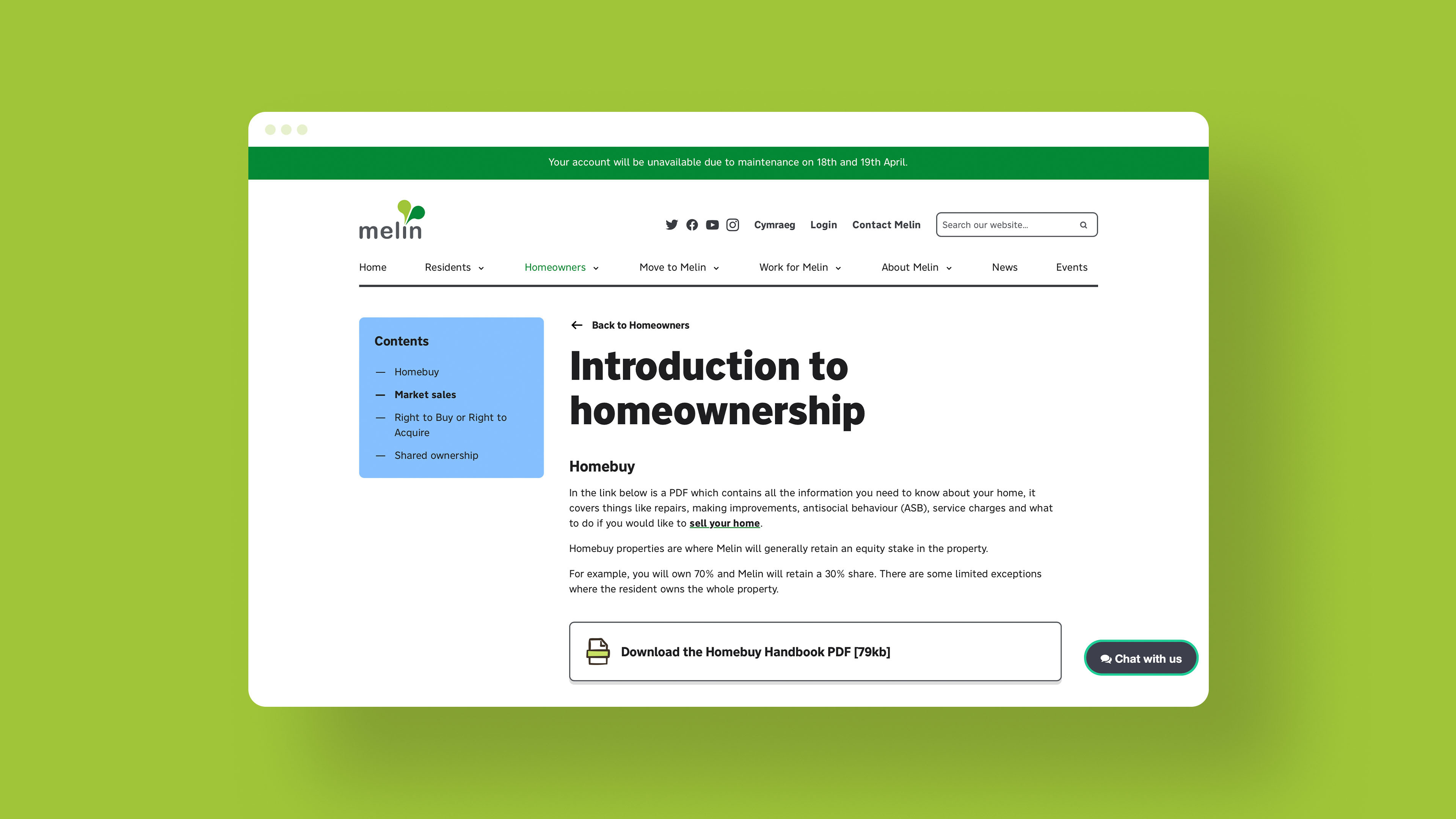
An example of on page sub navigation on the Melin Homes website
This is a good option for certain sites. However, in a responsive design world, there are some challenges around what to do with the second nav. Should it be at the top? Should it be at the bottom with an anchor link? If it is at the top, it'll push the content down. Should we hide it on small screens and toggle its display with a button?
The landing page
Another way might be to add a landing page to each top level nav item. In this way you can provide all the links people need in context and with supporting content. Again, this can be a good option for some sites. It presents some different design challenges though, as by necessity, the components that link off to these other sections will probably take up more space than a sub nav. What if you also need to include other content on that top level page? How do you determine and understand the priority of what users want "next". How do you measure this? What if different audiences want different things?
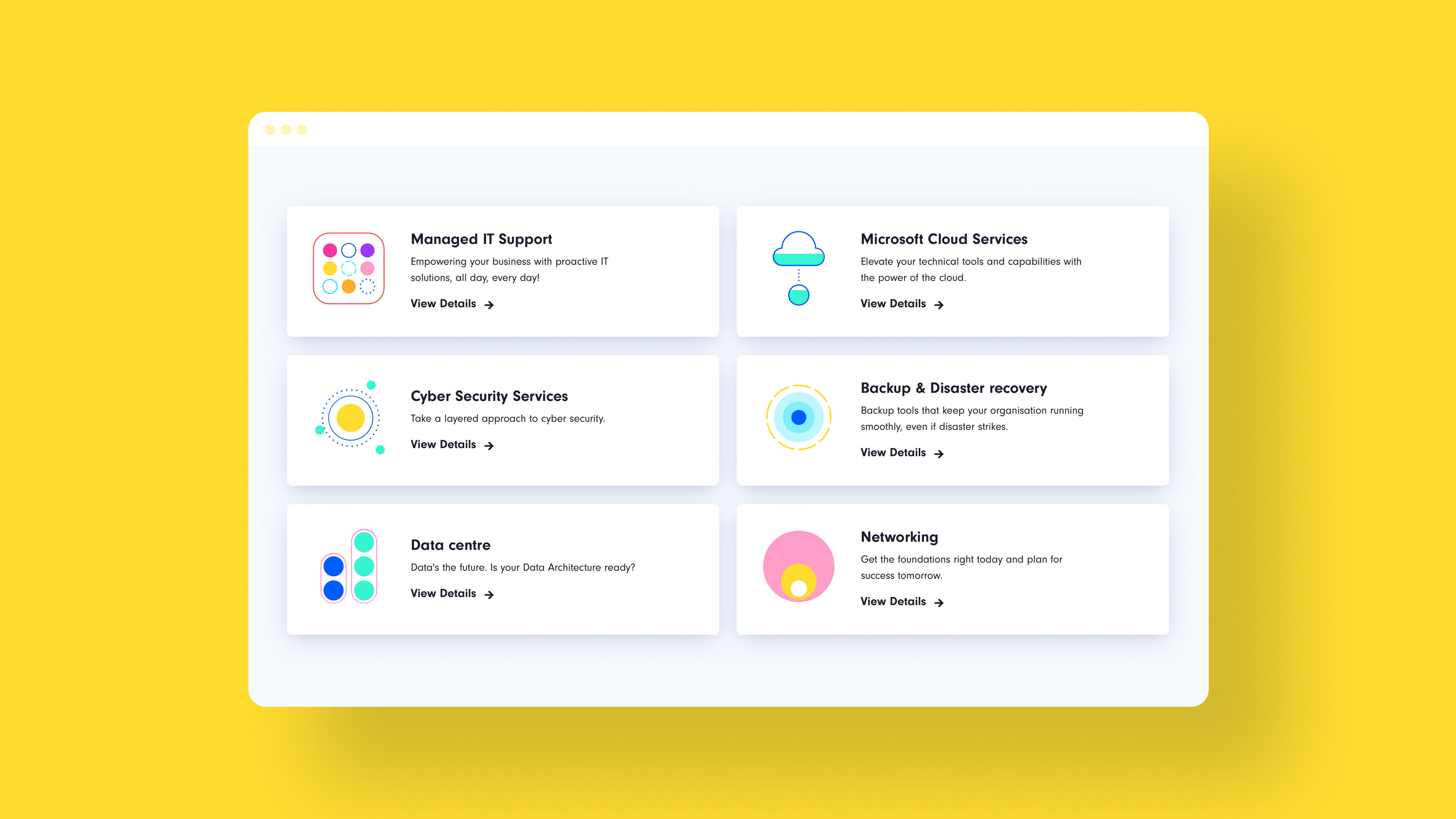
An example of landing page navigation on the Circle website
The popup nav
If we add some hover styles to these nested pages, revealing a sub-menu as a popup under the link, this would allow us to show users all the available pages hiding underneath About us and What we do.
This lets people jump to the child pages more easily from any page. It is a useful pattern to display child pages in context, giving a user a quick way to navigate, and also providing them a view of the overall structure of a site.
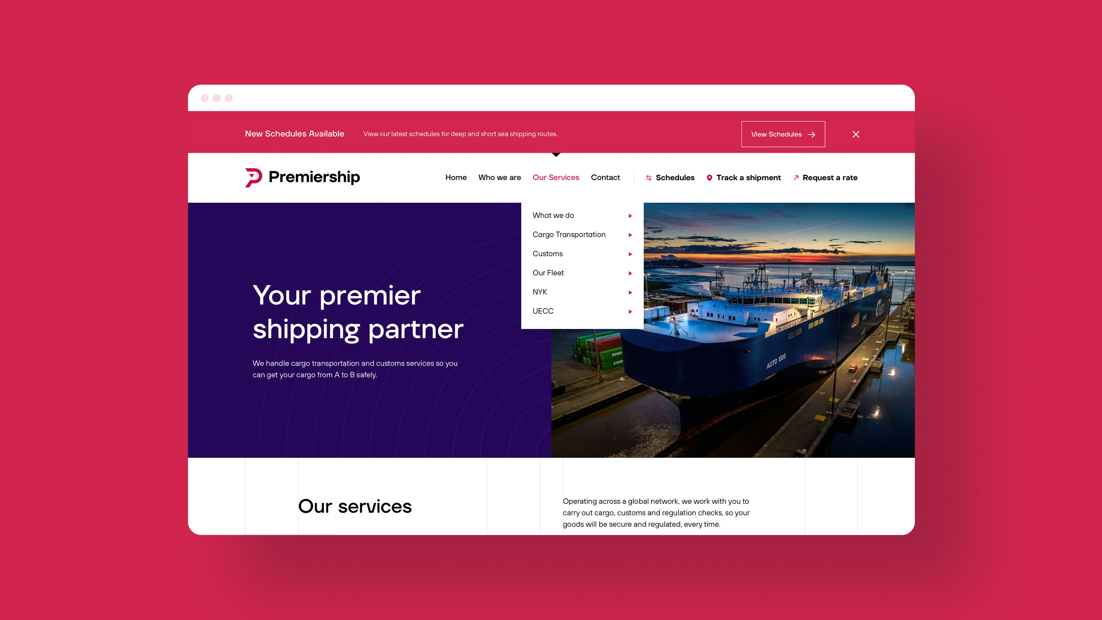
An example of popup navigation on the Premiership website
The mega-nav
This navigation pattern can be extended for bigger websites which have sections within sections. For example e-commerce sites with multi level taxonomies.
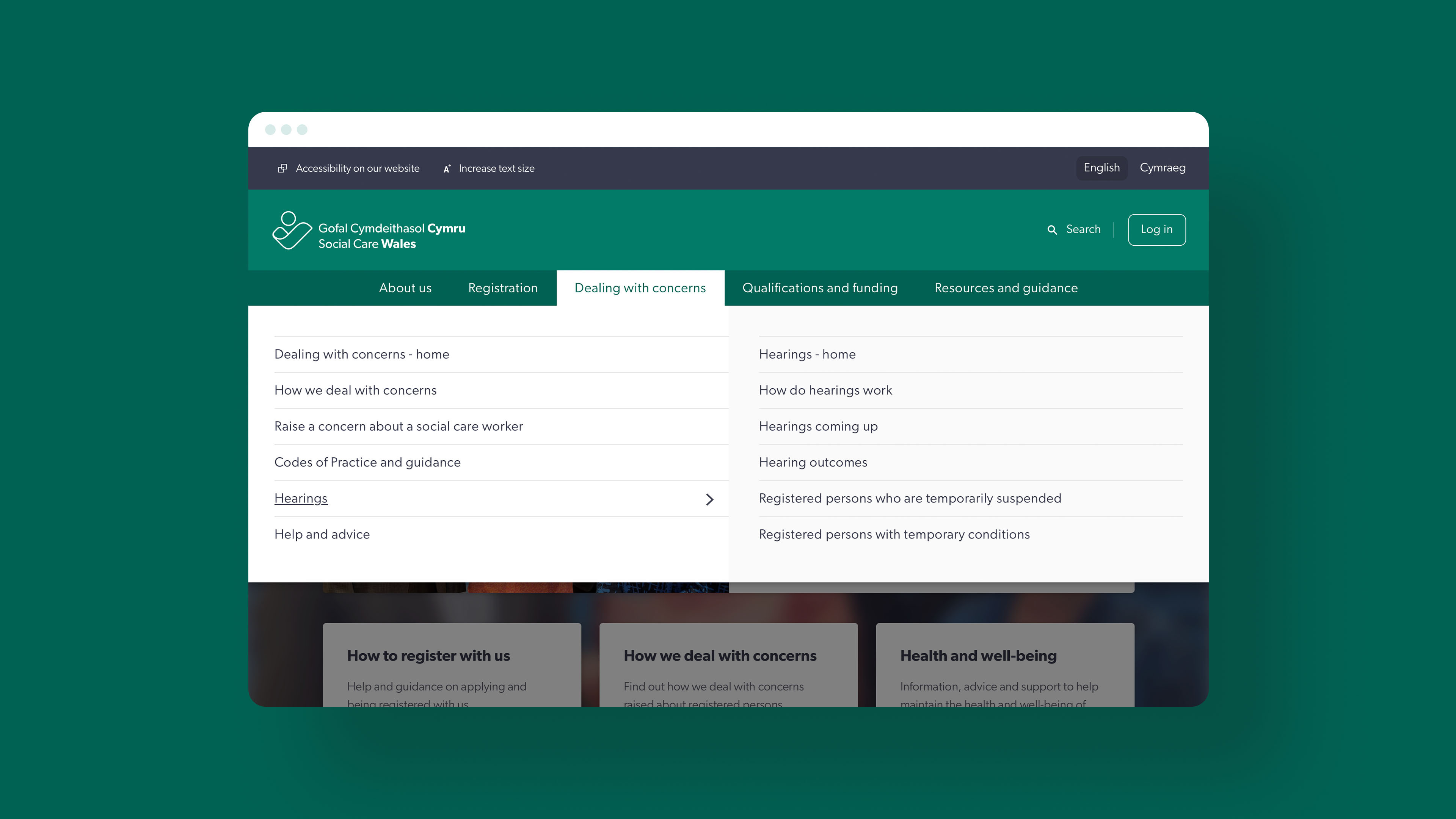
An example of a mega-nav on the Social Care Wales website
This works but it starts to get tricky achieving this with CSS and hover alone.
Complexities to consider
Issue 1 - The Buzz Wire Maze
If you accidentally mouse off of the links, the nav disappears. As the nav gets more complex, this is much easier to do. Depending on the design it can feel a bit like navigating a maze using your mouse.
People with mobility issues, or who need to zoom their screen in will also often have problems navigating these kinds of navs. It is very easy to hover off as you zoom and scroll around.
To fix this, you can add a number of design and technical considerations to make it a better experience. For example adding a delay to the nav closing which allows a user to re-hover the nav. You could also stretch the popup across the whole width of the site to avoid accidentally hovering away when zoomed in.
You can read how Amazon was engineering around this issue nearly 10 years ago (I am old).
Issue 2 - Keyboard users
It is important to make sure the navigation is usable with the keyboard. Some people (including me sometimes) prefer or need to tab around a website rather than using their mouse or trackpad. We can add the hover CSS when the user focuses on the links, but it ends up being a much worse experience. By default, the user needs to tab through every link in the whole menu, including all the sub-menu items until they get to their chosen link. To use our basic example, to get to the contact us link, I would need to tab 8 times (and that is a pretty small example of a mega-nav).
To improve this, it is necessary to write some JavaScript (JS) code to enhance the functionality. You can then add alternative keyboard controls so that it is possible to open the sub-menus only when wanted (for example using the arrow or space keys). This allows a user to tab across just the top level links and only open (and tab through) a sub-menu if they want to. This would reduce my tabbing to just 4 to reach the contact link.
The downside here is that you may need to implement non-standard keyboard interactions for opening, closing, and navigating the menu. If this is the case, you'll need to somehow communicate this to your users.
Issue 3 - Responsive design & touch
Things get really sticky when you consider how most users interact with your site, which is probably not by mouse or trackpad, but by touch.
It is expected that your navigation will look and work differently when using a phone or tablet. This is for 2 reasons:
- Smaller screen
- Touch input
On smaller screens, it is common to hide the navigation behind a menu (hamburger anyone?) button by default. The button will usually toggle a popup of some description (either full page or slide out panel) that will show you the top level links.
You can then usually tap on individual links to reveal any sub-menus for child pages. It is a lot like our hover nav, but instead of hovering the mouse over a link, you tap it. The reason for this is pretty straightforward - there is no hover on a phone screen, as there is no cursor.
A common pattern to deal with this is to use a "mobile" nav at all screen sizes below a certain threshold, and then a "laptop" or "desktop" nav above. This way you can expect touch on the smaller screens and allow hover on the bigger screens.
Fixed right?
Code split
Unfortunately, not. One difficulty here could be that you need to have 2 different approaches to how the nav and sub-menu opens and closes. Touch for small screens, and hover for desktop (more on the issues this causes below). You could write the code in such a way that it handles this, but unfortunately that is largely going to be based on device size, as knowing if the user is using (or could possibly use) touch or a mouse is very difficult to be sure of.
Mixed input devices
You are probably aware of touchscreen laptop (and even desktop) computers. You can also use a mouse or trackpad with an iPad. As with fixed width design, and adaptive design, we've made an assumption about how people use their technology and how that technology works. Not only is it possible to use touch on a large screen, and a mouse on a small screen, your users could be using both at the same time.
Why is this an issue?
The problem with hover
Everything so far can be solved by adding design and code complexity. Let's assume we are ok with this (I'm not as I find simpler code tends toward better experiences but for the purposes of this argument, I'll ignore that). We then need to consider:
- If we want the sub-menu to open on hover, we need to let touch devices open it on click.
- If we open it on click, what happens when the user clicks it a second time?
It can either go to a link (e.g. About us) or it can close the menu. If it navigates us to another page, that could be confusing for a touch user. They clicked the link to open a sub-menu. It is reasonable they expect tapping it again to close the sub-menu.
Maybe that works, but if the user is on a touch device, and they need to get to About us, they need to click the item again. This means the user has to interpret how to use the navigation. This is generally not a good experience.
Consider having the second click close the sub-menu. If a user moves the cursor with the intention of clicking the item to navigate, the following things will happen in quick succession:
- The sub-menu will open as the cursor enters the clickable area of the link
- as they click the link (intending to navigate) the menu will disappear.
Again, what happens next depends on the user interpreting the system you've built. They could re-hover the item by moving away and back again or they could try to click the link again to see if the menu opens.
Both of these examples make the user uncertain, and force them to do the work of figuring out how it works.
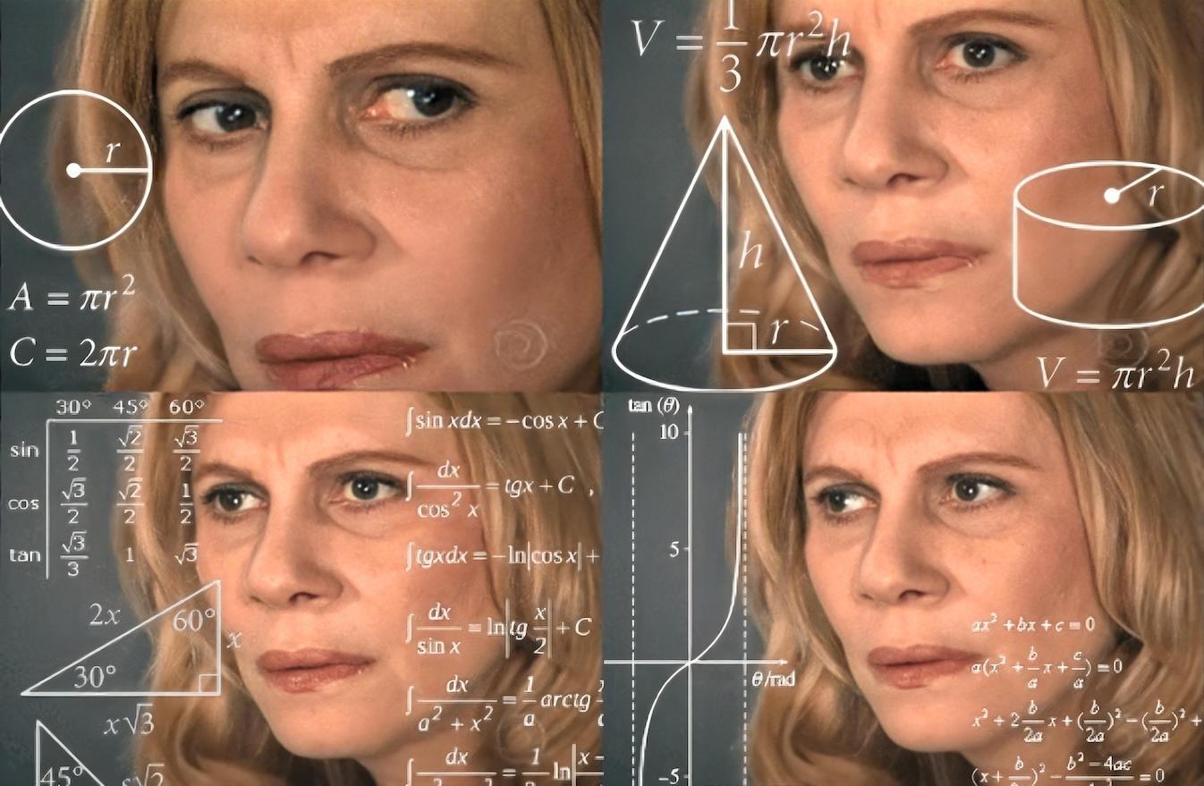
A typical user trying to work out how your navigation works
A better way
We need to find a solution to our mega-nav which allows us to do the following:
- Allow quick navigation to child pages from the main nav
- Makes the interaction model as predictable and straightforward as possible
- Keep the codebase across all screen sizes and devices as similar possible
Step 1 - Make it Progressively enhanced
We should make the nav work without JS. That could be by making it work with CSS on hover and focus states, or by ensuring we have a sub-menu on all pages which have child pages (and on those child pages). As discussed, neither of these options are the best experience, but thats ok. It is just the baseline if for some reason, JS is not available. If it is available, we can remove this CSS behaviour in favour of the enhanced approach.
Step 2 - Add some affordances
To make it obvious our nav items have sub-menus, we should put some kind of indication on the link (e.g. a icon). This will provide a hint to the user that a sub-menu approaches.
Step 3 - Add some accessibility considerations
We didn't touch on this above, but make sure you're using semantic markup and any attributes that will help. These are outside of the scope of this article, but things like aria-haspopup etc might be necessary here. I recommend reading the WAI Menu tutorial and the WAI ARIA Authoring Practices tutorial. You should also probably add a "close the popup" shortcut key. This is probably best done using ESC.
Step 4 - Ditch hover. Just use click
The problem of accidentally triggering a mega menu needs careful consideration. It is also the reason why I tend to avoid triggering mega menus on hover.
Paul Boag
boagworld.com/design/mega-menu
This might be controversial, but for me this is the least worst option. Especially when considering all of the examples we've seen so far.
Firstly, it is keyboard-accessible by default. I can tab across the top level links and just hit enter to toggle the sub menu. The affordances and aria information discussed above should give the user enough indication of the sub-menu.
Secondly, it keeps the interaction the same for touch and cursor so simplifies the experience across devices, and simplifies our code.
Finally, if the user is using a mouse or trackpad, they may expect the menu to open on hover. Instantly, they will realise it doesn't. Our handy icon has let them know there is something hiding below and can then click or tap to reveal it. In our (albeit limited) testing, this is generally much more predictable for users.
As a bonus, when the menu is open, you could rotate the icon. This will give the user a hint that clicking again will close it.
Step 5 - Don't make the top level item a link
Again, possibly controversial. This should use a button element which does nothing but toggle the sub-menu. This does however add a slight complication...
The problem with click
Having the nav item that shows a sub-menu not be a link presents a different kind of problem.
In our original sub-menu we had the following:
- About us
- Our mission
- Our team
Presuming that there is an About us page, how should we get to it if the top level item is not a link? We think having a duplicate link is the best (least worst) solution. Potentially a user will have an additional click when navigating to a sub-menu item but we think the negatives of hover outweigh this minor inconvenience.
Here are a few ideas on how to handle the duplicate link:
1. The heading pattern
We make the first item in the sub-menu a heading. This works well for larger sub-menus.
- About us ▾
- About us
- Our mission
- Our team
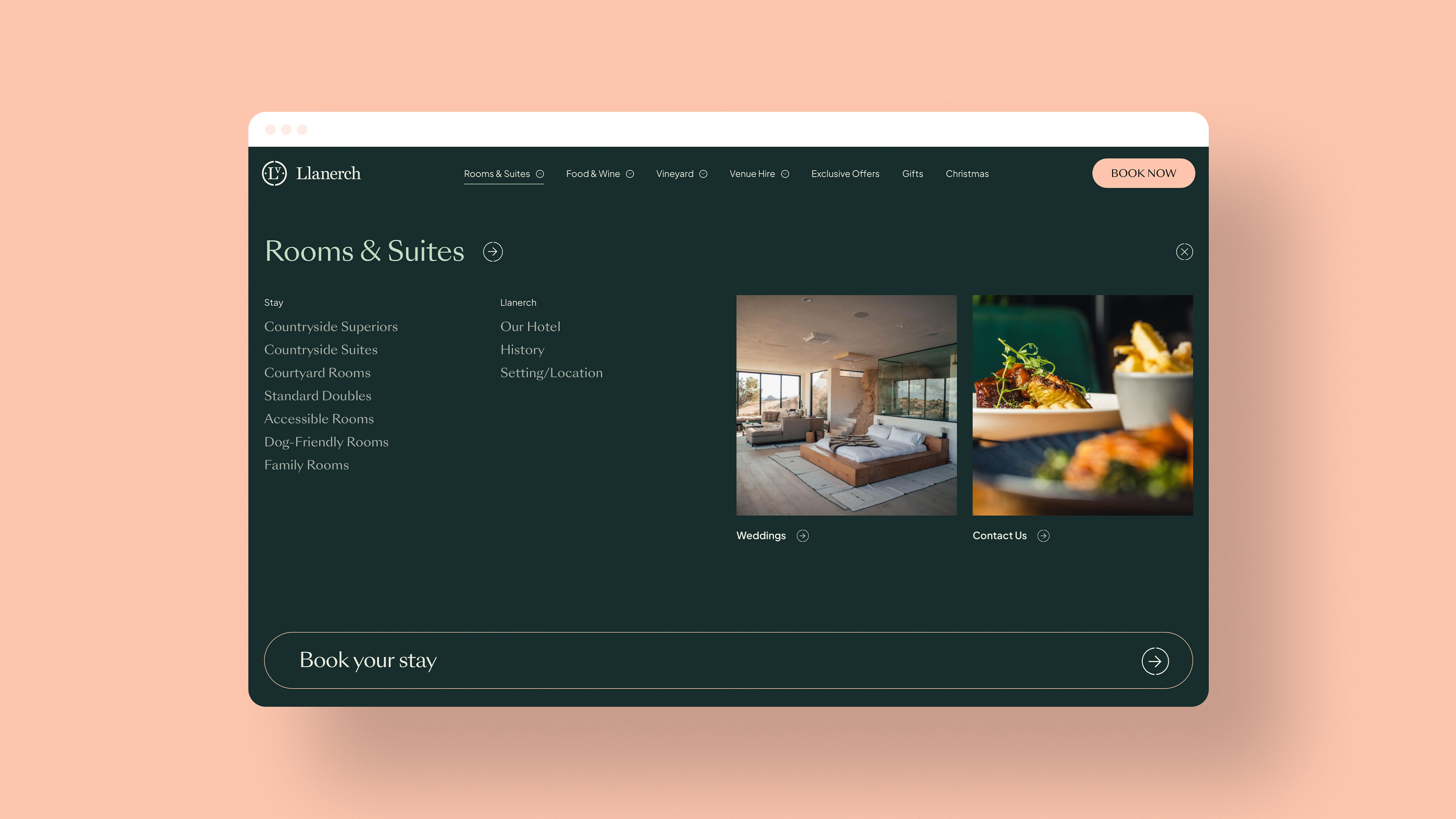
An example of the Heading pattern on the Llanerch website
2. The view all pattern
We can add a link to some kind of landing page for the section. This works better for sites where the top level pages are all a form of index page.
- About us ▾
- Our mission
- Our team
- Read all About us
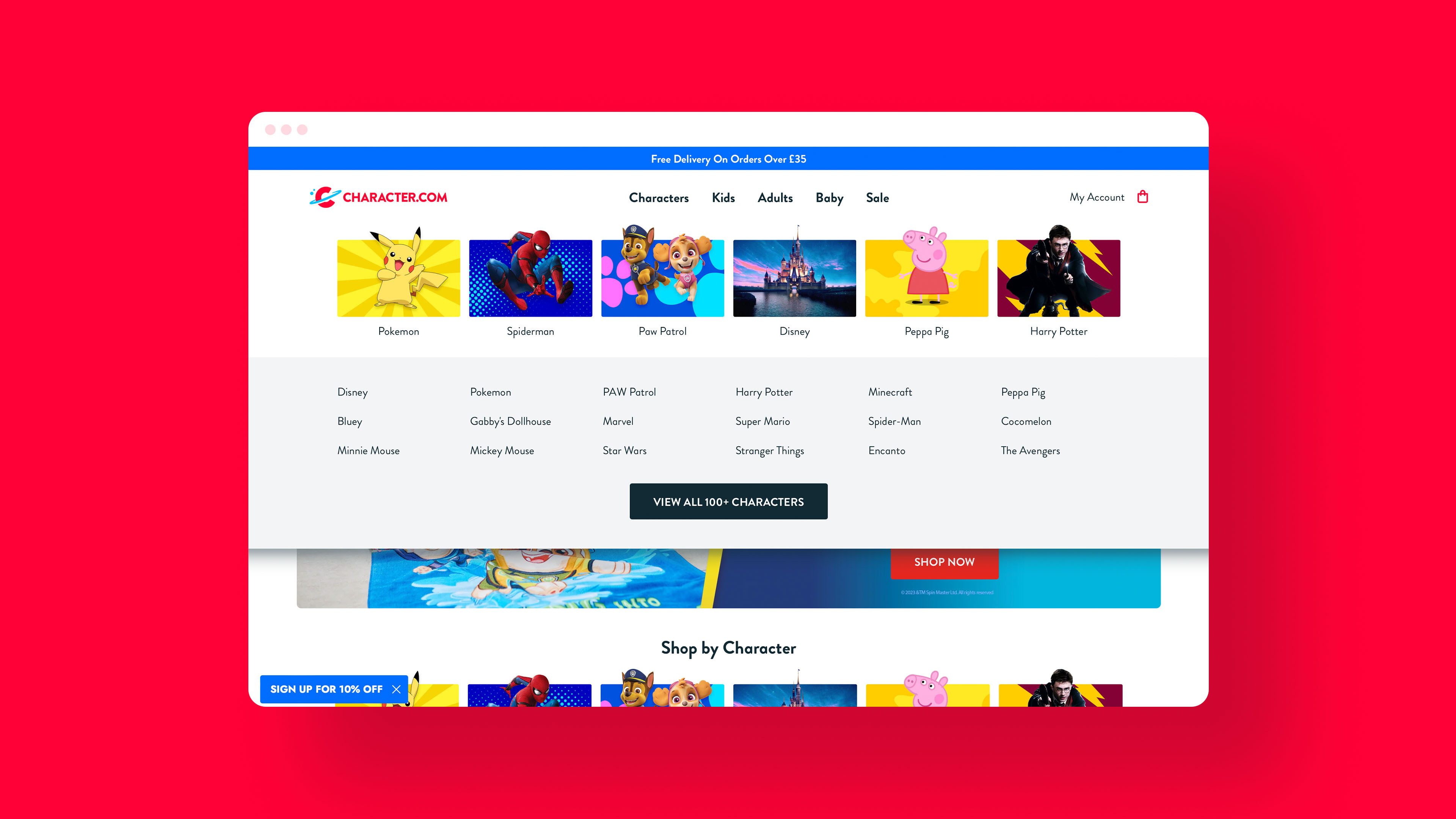
An example of the View All pattern on the Character website
3. The group pattern
We change the top level link to a grouping with no link to the actual site structure. This could be a good option for shallower structures. This isnt something weve implemented on one of our sites.
- Our company ▾
- About us
- Our mission
- Our team
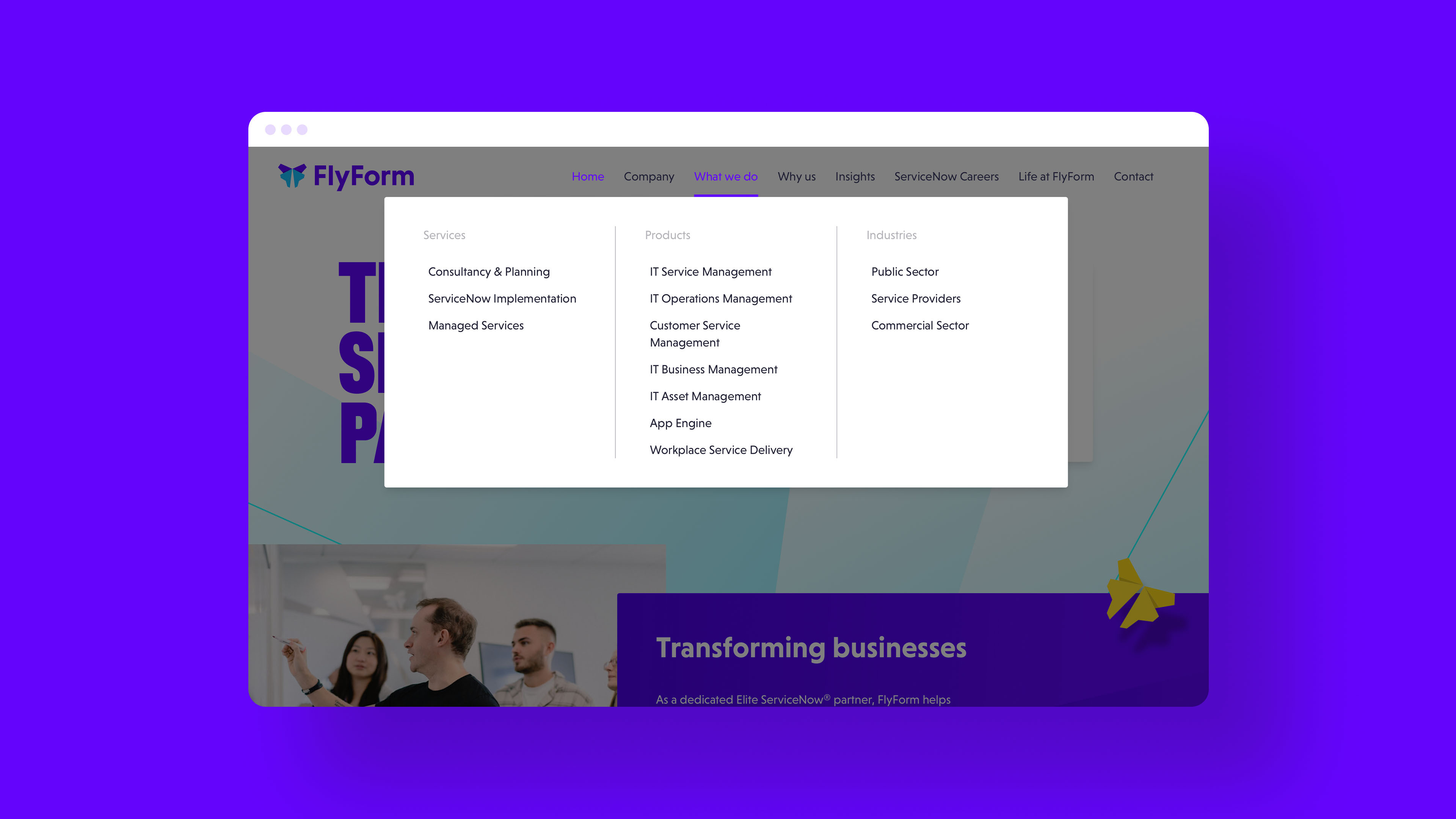
An example of the Group pattern on the Flyform website
Breaking up with hover
Having the website navigation sub-menus open on click only is not a perfect solution. However we believe it is better than all the alternatives we have considered. From a user perspective, it feels the most predictable, and the interaction has the most intent.
From a developer perspective it allows us to keep our code more or less the same for all inputs, and reduces a number of potential complexities we would need to add to manage handling touch and mouse events separately. This allows us to have simpler and therefore more robust code. We have found solutions to accessibility considerations, and have been able to provide a simplified baseline experience if JS is not available.
We have identified 2 problems: The double link problem has several acceptable solutions which, to us, are better than the sacrifices to UX and accessibility that the hover nav necessitates. The extra click for mouse users is not comparable to the additional problems hover creates for lots of different audiences.
If you made it this far, thanks and well done! I hope you find this post useful. If youd like us to spend some time considering your website in this much detail, you should work with us.
