Brief
Premiership Ltd approached us to reposition their brand and website so their services were at the forefront of what they do, instilling their confident tone and premium services with a new identity would help take them to the next level.
Outcome
We redesigned their identity and brand system to position them as leading agents in the shipping industry, proud to be premier.
The brand icon represents the masthead of a ship, being a forward thinking brand that leads the way.


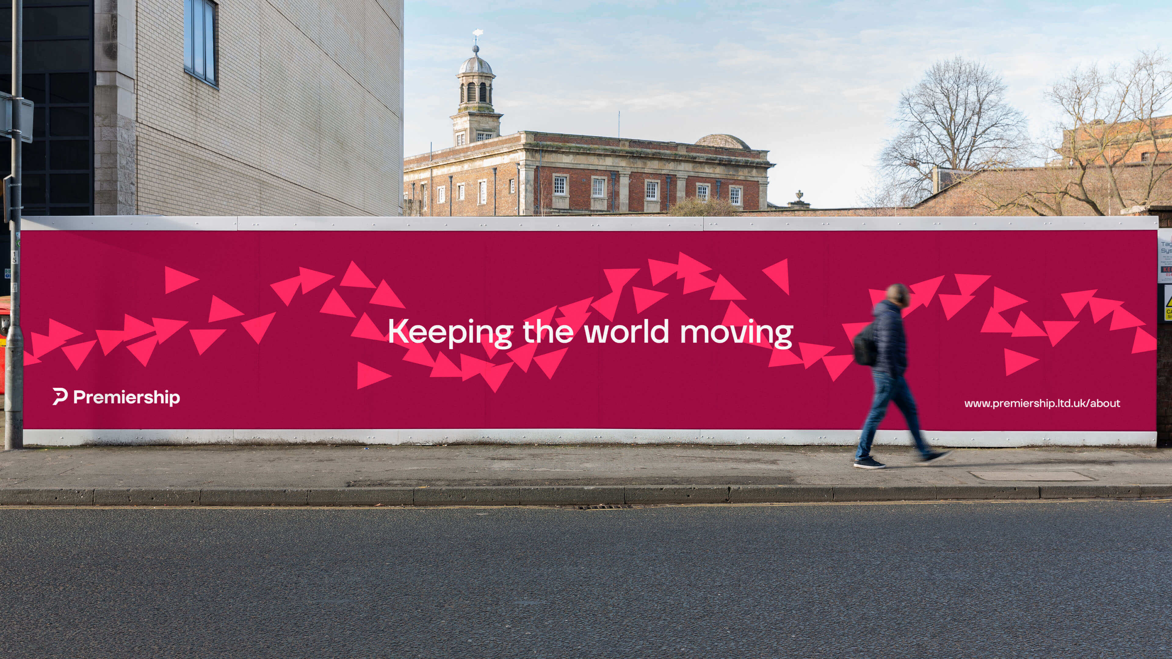
We developed a brand system inspired by shipping routes found across the globe. The design system works in different formations and patterns which helps communicate Premierships services.


The brand language and design system is adaptable to work with different media without losing it's connection to the identity.


The websites grid layout was inspired by cargo storage, we built a system using different grid lines which allowed components to fit together nicely throughout the site.


